
This is a GIMP tutorial for making rain clouds and lightning that I made for mandya. So here we go...
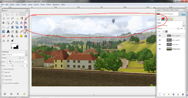
First, open the photo you want to edit. This is the photo I decided to start with (sorry it isn't modeling related, it's the only screenshot I had that would work for this tutorial). You may need to enlarge the photos to see the text better.
First, open the photo you want to edit. This is the photo I decided to start with (sorry it isn't modeling related, it's the only screenshot I had that would work for this tutorial). You may need to enlarge the photos to see the text better.

First we're going to start out with the clouds. Add a new layer by clicking on the icon at the bottom of the layers panel that looks like a piece of paper with the corner folded. Now, click on the paintbrush icon to open up the brushes section. Using white, use different cloud brushes to add clouds into the sky. The ones I used are from here


This is what my clouds look like.
Now add another new layer on top of that one. This one will be used to darken the landscape to make it look more stormy.
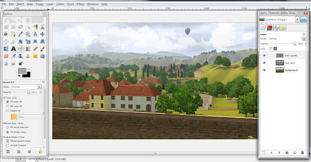
Fill in this layer with a grayish color. Mine is a medium-light gray. You could also use other dark colors like purple or blue if you want to add a hue to your photo.

Now add another new layer on top of that one. This one will be used to darken the landscape to make it look more stormy.

Fill in this layer with a grayish color. Mine is a medium-light gray. You could also use other dark colors like purple or blue if you want to add a hue to your photo.
Change the layer mode to "Multiply" so that it colors the image while still being able to see through it. I lowered the opacity down to about 75 so that the photo isn't super dark. Depending on the picture, sometimes you can use other modes like "Overlay" or "Soft Light".

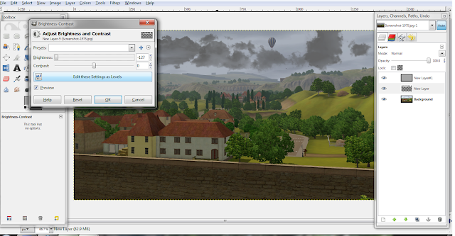
Since I don't like the look of the white clouds even with the gray coloring it, I'm going to use the Brightness/Contrast (Colors>Brightness-Contrast) option to darken the clouds to look more like storm clouds instead of white, fluffy ones.
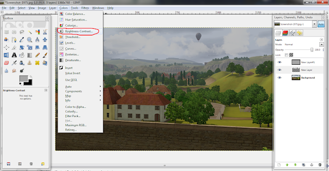
Darken it to your liking. In this case I brought the brightness all the way down. (Of course, if you want to skip this step, you are more than welcome to make the clouds dark to begin with :P) I ended up adding more clouds after this step because I felt that I didn't have enough so that's why the clouds look different in the next step.
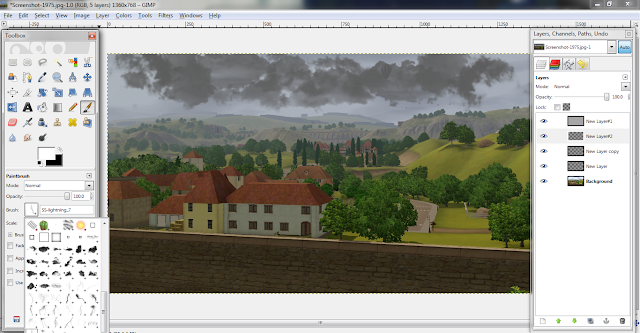

Alright, now for the lightning. Create another new layer below the solid gray layer and above the clouds layer. Open up the brushes again and use the lighting brushes (found here) to add them to the sky. With brushes, I tend to do one per layer so I can move them around individually (that is not required though). As you can tell, they don't look extremely realistic because they have sharp edges on the end in the clouds.
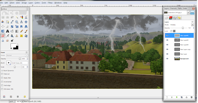
To fix this, I am going to use a medium-sized soft round eraser and erase around the edges to make it look more like it is coming out of the clouds.
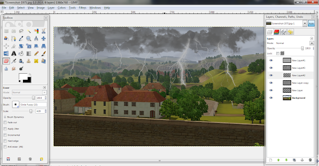
This is what it looks like afterwards. It looks much better now.

To fix this, I am going to use a medium-sized soft round eraser and erase around the edges to make it look more like it is coming out of the clouds.

This is what it looks like afterwards. It looks much better now.

On this layer, we are going to use the gradient tool to add a black to white gradient to add a little depth to the photo. To apply the gradient, click and drag the cursor from the top to the bottom. It should turn out to have black at the top and gray/white on the bottom.


Now change the layer mode to "Burn" (other modes can be used as well but for this particular photo, that one turned out the best). Lower the opacity so it isn't so harsh. I lowered it to 57%. Your numbers may vary.

Now you're done with this tutorial. I decided to take it a step further and add some rain to make it more realistic looking using this tutorial

Before:


As always, feel free to ask questions. I'll answer them to the best of my ability.
No comments:
Post a Comment