Tuesday, February 21, 2012

Cutting Out Sims (GIMP)


This tutorial will show you how to cut Sims out with GIMP.

First, Open the picture of your sim that you want to cut out. It is recommended to use a photo with a bright, solid-colored background (one that your model is not wearing) because it is a lot easier and less time consuming to cut out. I am using a photo of one of my models, Leila.


Next you are going to click on "Select" in the top bar and choose "By Color" and click on the background color.


This will select everything in the photo of that color. Add a new layer below the sim layer.


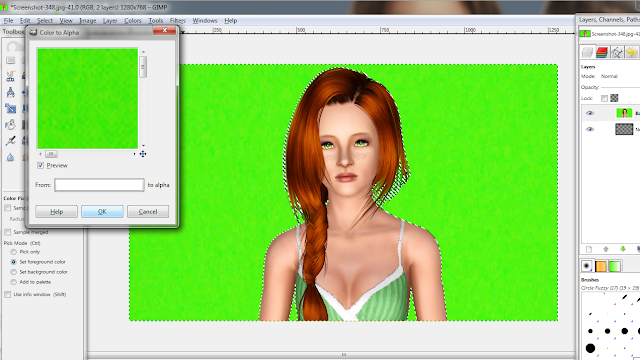
Now, go to the "Layer" menu, choose Transparency and then color to alpha.


This box will come up. Click "OK" then with the sim layer selected press the delete or backspace key on your keyboard.


This is how it should look.


As you've probably noticed, there is a lot of green still left in her hair. To fix this, get the color-picker tool (Circled below) and sample a section of the hair.


Now, make a new layer and choose a brush. Use the brush to color over the green areas.


To make the coloring less obvious, change the layer mode to "Color".


Choose "Select" and the "By Color" like you did earlier and with the sim layer selected, click on the background.


This will select everything but your sim. Select your color layer and hit delete. This should get rid of the extra color around the hair.

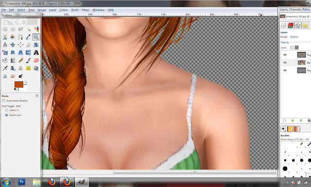
Now we are going to get rid of the green around her shoulders. To do this, use the eraser tool and, with a small eraser, carefully erase all around the sim to get rid of the green.

This is an example of what it should look like when your done.


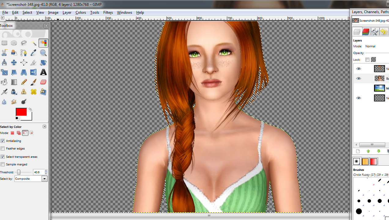
After that. you are done and ready to use your sim with any background you choose. :)


Note: my "finished" product for this tutorial is not nearly done in terms of editing. From there I like to smooth the skin, add shading, fix brightness/contrast, etc. This is just an example of what it would look like on a background.

If you have any questions, feel free to ask. :)

Cutting Out Sims (Photoshop)

This tutorial will show you how to cut Sims out with Photoshop.

First, Open the picture of your sim that you want to cut out. It is recommended to use a photo with a bright, solid-colored background (one that your model is not wearing) because it is a lot easier and less time consuming to cut out. I am using a photo of one of my models, Leila.


Next, you are going to click on the eyedropper tool (circled below) and click on the background to sample the color.


Now, go to the "Select" menu in the top bar and choose "Color Range"


Adjust the settings so that in the preview you see your sim in solid black and the background in solid white. Click "OK".


Now everything in your picture that is the color of your background will be selected. Now you have a couple options on what you could do next.

Option 1: 
 If you do not plan on moving sim to new document right away, double-click your picture in the layers panel and click "OK" to make it a layer by itself (no longer the background layer). Create a new layer and place it underneath your picture. Then, with your picture layer selected, press delete (or backspace).

This is what it should look like.

Option 2: 

If you want to move your sim to a new document at this point, go to the "Select" menu and choose "Inverse". This will select everything that is not the background color (in this case, the sim). You can then drag your sim into the new document.


No matter which way you decide to cut out the sim, there will be green remnants on the edges of her hair (some hair will have more green than others).


To fix this, use the eyedropper tool again but this time sample an area of the hair. I sampled from the area circled in the picture below.


 Now, choose a round brush (soft or hard does not matter in this case). I chose a size 36 soft, round brush.


On a layer above the sim layer, use the brush to color over the green (or whatever color your background is) areas.


Obviously, at this point, it doesn't look very pretty. To make it look better, go to the layer mode drop-down box and choose "Color". This will color the green areas to match the hair color.


So now it looks a little better but the color is bleeding out onto the background.To fix this, hold the control (or command if on Mac) key and click on the layer with the sim. Now with the color layer selected, go to the "Select" layer and choose "Inverse". Hit delete or backspace and it will delete all the color not on the sim.


This what you should get.


Okay, so now the hair is fixed, but there is also green around the edges of the skin (like, in this case, on her shoulders).


There are different ways to get rid of this, but the easiest way, in my opinion, is to get a small, soft eraser (using the eraser tool) and carefully erase around the edges.

Before:


After (this was just a quick example so it is a tad bumpy):


After you erase all the way around, your sim should look like this.


You are now done cutting out and fixing up your sim. You can now add a background or do whatever you please!


Note: my "finished" product for this tutorial is not nearly done in terms of editing. From there I like to smooth the skin, add shading, fix brightness/contrast, etc. This is just an example of what it would look like on a background.

If you have any questions, feel free to ask. :)

Tuesday, February 14, 2012

First Video Tutorial Added!

The first of my video tutorials, Siggy Basics (Photoshop), is now added to the tutorial page! Hopefully it isn't too confusing :)

Monday, February 13, 2012

Color Adjustments (GIMP)

 Color Adjustments (GIMP)

This tutorial will help you learn how to adjust colors in your photos. This is more a general photo editing tutorial but it can be applied to signatures as well.  I want to say ahead of time, I don't recommend using all these adjustments on one photo because it could be overly bright or contrasted. I only did them all to show the effects it has on photos (which is why my end result is a little overwhelming  xD).
First, open up the photo you would like to edit. Here is mine:


If you'd like to use this photo for practice purposes, you can find it here.

As you can see, it is pretty dark and dull.

To start out editing, I am going to go to the Colors menu and choose "Brightness/Contrast". Each photo is different so play around with the settings until you find something you like. Since my picture is pretty dark, I am going to set the brightness to 10 and the contrast to 13. Click "Edit these settings as levels"


This takes you to another adjustment that you can make to a photo called "Levels". You could access this through the colors menu as well. Again, play around with the settings until you get something you like. For my photo, I changed the values to 6, 1.00 and 145. Click "Ok".


Another adjustment you could use is "Color Balance". It is found in the same menu as the previous effects.  This is the box that pops up. Here you can slide the bars to adjust how much each color is present in the photo. For example, for my photo I moved the top bar towards Red (with a value of 20), the  I moved the second bar towards green  (with a value of 45) and the third bar I moved towards yellow (with a value of -49). Moving the bar to the right is a positive value and moving the bar to the left is a negative value. I usually just play around with the settings until I get something I like (just like I do with most things lol).


Hue/Saturation (again found in the same area) is another option to adjust color. A box pops up with three options: Hue, Saturation and Lightness. Hue is to choose the color. Saturation adjusts how light or dark the color is and lightness makes it brighter or duller. (Correct me if I am wrong, I'm not an art major so I may have gotten those terms mixed up or incorrect).  For my photo, I changed the hue value to -7, the saturation value to -16 and lightness to 14.

 
Next, is a little trick that I like to use to add a color tint to a photo and it is a lot less complicated than other options. First, make a new layer (see "Basic Techniques" tutorial if you need help).
Then using the paintbucket tool, fill the whole layer with a color of your choosing (in this case I chose a light yellow). 


After that, click on the arrow on the drop-down box on the top of the layers palette (it should say "normal" by default). Choose "Soft Light".


For this picture, the yellow came out pretty strong so I lowered the opacity (located at the top of the panel) to 65. You can use this method with gradients instead of a solid color as well. 


 This is how it looks now.


Before Adjustments:

 
After Adjustments:


As you can see, there is a big difference. As stated before, I don't normally do all those effects on one photo because it makes it really bright and at times overwhelming. This was for tutorial purposes only.

I hope this helped you guys out a bit. If you have any questions, don't be afraid to ask :)