
Basic Siggy Techniques (Photoshop)
Video Tutorial:
**This is made to go along with the step-by-step, not as a stand alone tutorial. Enjoy!**
Step-By-Step:
First, open Photoshop.
Once it is open, go to File/ New... A window will pop up. The size I usually use for siggys is 600 pixels (width) x 100 pixels (height). For the resolution I usually keep it at 72 pixels. If it is a bigger document I will change it to around 300 pixels high. You can leave everything else on the default settings. After changing the size and resolution, click "OK".


You now have a blank document and you are ready to start making your siggy!

Let's start out with the "Horizontal Text" tool. It looks like a capital T and is located above the black arrow icon in the toolbar on the left-hand side of the page.
Choose a font from the drop down box at the top of the page and the size and type whatever you would like to appear on your siggy. If you want to change the size of the text after you typed it out, highlight it by having the text tool selected and dragging over the text you want to change. Then just choose (or type in) a different size in the box at the top of the page.
Choose a font from the drop down box at the top of the page and the size and type whatever you would like to appear on your siggy. If you want to change the size of the text after you typed it out, highlight it by having the text tool selected and dragging over the text you want to change. Then just choose (or type in) a different size in the box at the top of the page.

Before I go on, I want to explain about the layers panel (circled in the picture below). This panel is by default at the bottom right hand side of the page. You can move it wherever you would like. If you cannot see it, go to the "Windows" menu in the top bar and choose "Layers" and it should show up. As you can see, at this point you have two layers, the background (bottom) is the first layer that comes with the new document and is locked (meaning you cannot use it unless you unlock it). The layer on top is your text layer which is automatically created when you add text with the text tool. Layers listed towards the top of the layer will be on top (or in front) of the layers underneath it in the list. Keep in mind that when you add text (or any images) it will automatically be added above the layer you have currently selected.

Now let's add a plain background. First choose a color from the color panel. It looks like two boxes overlapping each other. The box in the front is the foreground color and the box behind is the background color. Double click on the front (foreground) box and choose whichever color you like. For this tutorial, I chose red.


Now make sure your background layer is selected and click on the document. Your plain color should be behind the text. If it is not then drag the colored layer underneath the text layer. It should look something like this:

Now that we have a background and some text, let's add a new layer. Click on the little icon at the bottom of the layers panel that looks like a square with a corner being peeled up. If you have the background layer selected, it will add it between the background and the text layer (which is where we want it for the purpose of this tutorial). If you had the text layer selected, then the layer was added above the text layer and you will need to click on the name of the layer and drag to move it underneath the text layer.

Next, we will use a brush to add a nice little touch to the background of the siggy. Click on the "Paintbrush" tool (which looks like a paintbrush) and then go to the drop down box in the top bar to choose a brush shape(and use the colors palette to choose the color you want).
For this tutorial, I chose a brush that looks like rays from the sun ( download link provided under "resources" section on this thread) and I chose white for a color. Make sure your newest layer is selected and click to paint on the design.


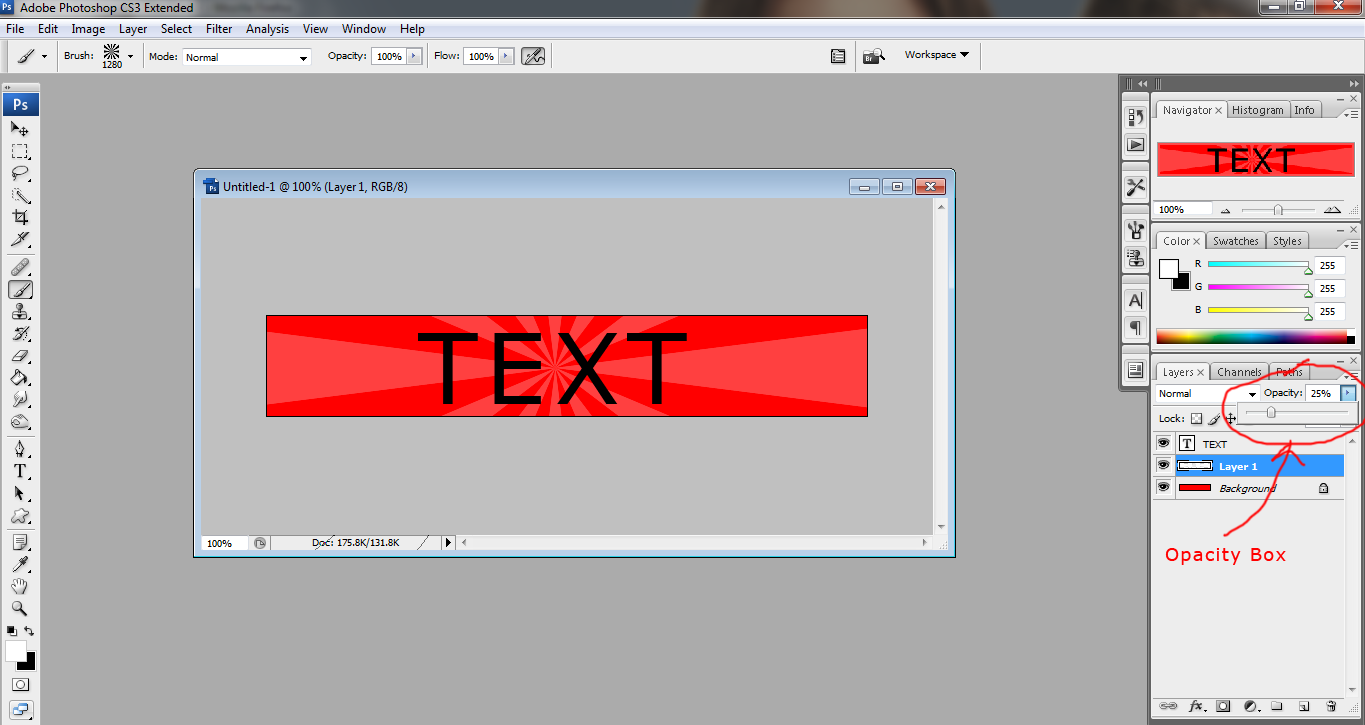
Okay, so now we have the design painted on but it seems to take away from the text, making it hard to read. To fix this, make sure the "blending options" (Box at top of layers panel, see picture below)is set to "Normal" which it is by default. Change the opacity to make the design more transparent. I changed it to 25% which gives it a nice overlay. If you have a lighter background color you can try using the "Overlay" mode instead to get a cool effect. I will cover more about the Blending options box in another tutorial.


And you're done. Here is the finished product.

This is a very simple siggy but I use this technique all the time. Once you learn the basics you're on the way to making really awesome siggys. The best way to improve is to play around and experiment with different effects. If you have any problems, just leave a reply here or comment on my page. Have fun and good luck! :D
No comments:
Post a Comment