Monday, February 13, 2012

Black & White (GIMP)


This is a quick and easy to turn your photos black and white using GIMP.

First, open the picture that you would like to change.


After it is opened up, go to the "Color" menu in the bar across the top of the screen and choose "Desaturate"


A window will pop up and you select the option that you like the best for your photo. I left it on the default setting "Lightness" for this tutorial.


You are done! Just go to the "File" menu and choose "Save As..." to save your picture.


Name your picture, choose where you want it saved and the format you would like to save it as.  The common ones are .png and .jpg. I generally use png because it is better quality.

Black & White (Photoshop)

This is a fast, easy way to make your photos black & white. It is simple but can give your photos a more dramatic effect.
 
You can make pictures black and white by going to Image>Adjustments> Black and White. You will get the box shown below.


If you just want it plain black and white, then click okay.  If you want to add a little colored tint, play around with the settings to your liking (I haven't actually played around with these so I can't help you there :P). 

You could choose Desaturate in the same menu if you want a plain black and white photo as well.  Unlike the Black & White box, you don't have an option to choose colored tints.

Color Adjustments (Photoshop)


This tutorial will help you learn how to adjust colors in your photos. This is more a general photo editing tutorial but it can be applied to signatures as well.  I want to say ahead of time, I don't recommend using all these adjustments on one photo because it could be overly bright or contrasted. I only did them all to show the effects it has on photos (which is why my end result is a little overwhelming  xD).

First, open up the photo you would like to edit. Here is mine:


If you'd like to use this photo for practice purposes, you can find it here.


As you can see, it is pretty dark and dull.

To start out editing, I am going to go to the Image menu, go to Adjustments and choose "Brightness/Contrast". Each photo is different so play around with the settings until you find something you like. Since my picture is pretty dark, I am going to set the brightness to 100 and I am leaving the contrast at 0. Click "Ok"


Next adjustment that you can make to a photo is called "Levels". To access this box, do the same thing as you did before but choose "Levels" instead of "Brightness/Contrast". Again, play around with the settings until you get something you like. For my photo, I changed the values to 61, 2.31 and 255.


Another adjustment you could use is "Color Balance". It is found in the same menu as the previous effects.  This is the box that pops up. Here you can slide the bars to adjust how much each color is present in the photo. For example, for my photo I moved the top bar towards Red (with a value of 25), the second bar I left the same and the third bar I moved towards yellow (with a value of -38). Moving the bar to the right is a positive value and moving the bar to the left is a negative value. I usually just play around with the settings until I get something I like (just like I do with most things lol).


Hue/Saturation (again found in the same area) is another option to adjust color. A box pops up with three options: Hue, Saturation and Lightness. Hue is to choose the color. Saturation adjusts how light or dark the color is and lightness makes it brighter or duller. (Correct me if I am wrong, I'm not an art major so I may have gotten those terms mixed up or incorrect).  For my photo, I changed the hue value to -1, the saturation value to 24 and lightness to 11. If you check the colorize box, then you can have a color that overlays the whole photo (in this case I did not have it checked).


This is how it looks afterward:


Next, is a little trick that I like to use to add a color tint to a photo and it is a lot less complicated than other options. First, make a new layer (see "Basic Techniques" tutorial if you need help).


Then using the paintbucket tool, fill the whole layer with a color of your choosing (in this case I went with green). 


After that, click on the arrow on the drop-down box on the top of the layers palette (it should say "normal" by default). Choose "Soft Light". For this picture, it did not make too much of a difference but there are times when it helps to give a whole photo a unifying color scheme. You can use this method with gradients instead of a solid color as well.


Before Adjustments:


After Adjustments:


As you can see, there is a big difference. As stated before, I don't normally do all those effects on one photo because it makes it really bright and at times overwhelming. This was for tutorial purposes only.


I hope this helped you guys out a bit. If you have any questions, don't be afraid to ask :)

Text Effects (GIMP)

Text Effects (GIMP)
 
This tutorial will show you what kinds of effects you can add to text to make it "pop".

Adding effects to text in GIMP is actually quite simple. To start out, I just have black text on a white background. 


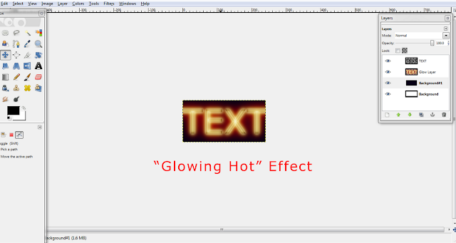
I found out that there are some pretty cool pre-made effects already in GIMP. To access them, go to the "Filters" menu in the bar at the top of the page and go down to "Alpha to Logo". Under that section there is a whole list of pretty cool effects. All you do is click on them. A box will pop up and you can adjust the settings how you want. I left everything on the defaults.  


Here are a few of the effects:

"Glowing Hot" 


"Alien Neon"  


"Neon"


"Chrome" 

 
"Frosty" 


For some reason, when the effects are applied, it crops the image to just the text. If anyone knows how to correct this or why it does this, I'd like to know.  

Okay, now for a couple less dramatic, do-it-yourself, effects.

First I'll show you how to make a drop shadow behind the text.

Go to the "Filters" menu, choose "Light and Shadow", then choose "Drop Shadow".


A window will then pop up. I left everything on the default settings except for the Offset Y which I changed to 0.
 
  
This is what you get. 

  
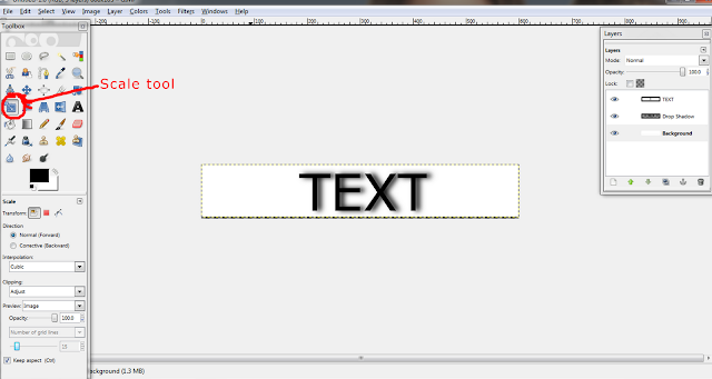
As you probably notice, part of the background is cut off. To fix this you can use the scale tool (above the paintbucket), click on the background and drag until it fills the full document again. 


 Another easy effect is called "Perspective". To access this, go to the "Filters" menu, choose "Light and Shadow", then choose "Perspective". A window will pop up. I left all the settings on default and clicked "OK". 


This is what you get:
  

To me the shadow that is created it pretty sharp looking and I want it to look more blurred. To do this go to "Filter", "Blur", "Gaussian Blur". I changed the horizontal and vertical blur radius to 10px and clicked okay. 

  
This is the result: 

  
I like it but I want the shadow to be a little lighter so I lower the opacity (located at top of layers panel) to 50%. This is what you get: 

  
Well, that is all that I have in terms of text effects for GIMP for now since I am still learning this stuff myself. Hopefully this helped you guys get started at least.

Text Effects (Photoshop)

This tutorial will show you what kinds of effects you can add to text to make it "pop".

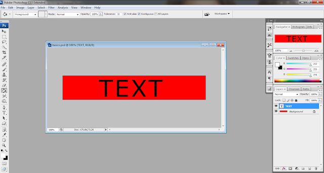
I am going to start out with black text on a red background. See "Basics of Siggy Making" tutorial if you want to know how it's done. 


Make sure you have your text layer selected and click on the little icon that looks like a lowercase f at the bottom of the layers panel. This is called the "Layer Styles" panel. A menu will pop up. You can either choose the effect you want to use directly from there or go to the top option that says "Blending Options". For tutorial purposes, we will choose the blending options. 


This is the window that will pop up. This is where you can choose the mode of the layer (it is the same as the drop down box at the top of the layers panel). 

First, we are going to add a drop shadow to give the text some depth. This is what it looks like on the default settings. 


 I decided to tweak it a little to make the shadow a little fainter and a little farther from the text. I changed the opacity to 50%, distance to 7, and size to 10. Lowering the opacity of something makes it more transparent. Increasing it makes it more solid. The distance for the shadow is how far away the shadow is from the text. The size controls how big the shadow is. There is also a spread option which changes how far the shadow spreads out. You can also change the angle of the lighting if you want the shadow in a different position. 


Next, we're going to add a bevel. Here you can make your text look like it is coming off/sinking into the page. There are five options for the style.
There is the default style, Inner Bevel.  


There is Outer Bevel. 

 
There is Emboss.  


There is Pillow Emboss. 


There is also Stroke Emboss but that only shows up well if you have a stroke (or outline) on your text.

For this tutorial, I changed the depth to 72 and left everything else on the default settings (on Inner Bevel style). There are many things you can do with this effect. You can choose the technique (Smooth, Chisel Hard, and Chisel Soft). With this, you can make the text look like it is chiseled out of the background. With the "Bevel and Emboss" area you can also change the depth of the text and the contour of the gloss (highlights) on the text.

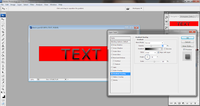
Next, click on "Gradient Overlay". I like to use this option to give the text some color variation. Since my text is black, I will leave the mode on Normal and lower the opacity to 40%. I left everything else is the same. If you have text that is not black or white, you can try using the "Overlay", "Color Burn", and "Color Dodge" modes instead and play around with the opacity to get some cool effects.


Last thing we are going to do is add a stroke (outline). Click on "Stroke" (last option in the list). As you can see, you can change the color to whatever you want. I changed mine to white. You can also choose how thick the outline is. I lowered it to 1px. I left everything else on default settings. With this panel, you can choose where you want the stroke to be (Inside, Outside or Center) with the "Position" drop down box. Like most other effects, you can change the opacity to your liking.  

  
Original:

 
Finished Product: 


 There are other effects in this section but I won't go over them. If you need help with them just ask. These include "Pattern Overlay" which allows you to add patterns to your text, "Outer/Inner Glow" which allows you to add a glow around (or inside) the text and there is also "Color Overlay"(self explanatory), "Satin" and "Inner Shadow" (Shadow inside of text instead of behind or around it).

A lot of the times when I'm making siggys, I just play around with the settings until I find something I like. I don't have any specific settings that I always use because each siggy is different. So go wild, and have some fun with it!