Showing posts with label photoshop. Show all posts

Saturday, August 25, 2012

Edge Smoothing (Photoshop)

This tutorial shows how to smooth rough edges in Photoshop. Please note, this only works on pictures cut from the background (in this case, Sims). Here is the photo that I am going to start with (please ignore the crappy cut-out of the sim).


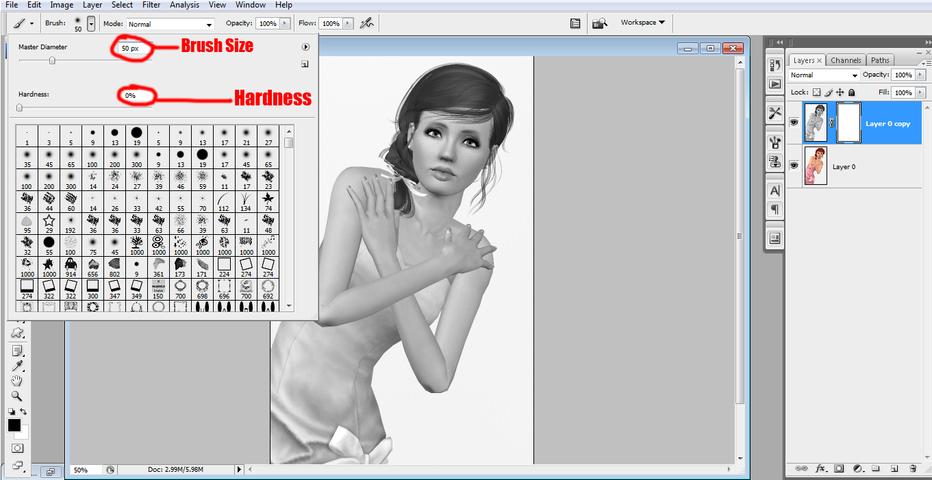
For this tutorial, we are going to use a layer mask to smooth the edges. Shift-click your cut-out layer so that the sim is selected. Now, click the small icon at the bottom of the layers panel that looks like a white circle in a gray rectangle (circled below). Your layer mask will be added to that layer and it should look like silhouette of your sim on a black background.


With the layer mask selected, go to Filter>Blur>Gaussian Blur and set the radius to around 3. Click okay.


Now your sim in the layer mask should be slightly blurry. With that layer mask still selected, go to Image>Adjustments>Levels. Play around with the levels by moving the outer arrows towards the middle arrow until the edges on your sim look smoother. You can also move the middle arrow around to get the desired effect. My settings are shown below. The values for the arrows read 145, 0.53 and 227. Your photo will change while you adjust the levels so you can see the result before clicking Ok.
As you see from the photo below, the edge on my sim's shoulder is a lot smoother than it was before (I added a black background to it so I can see the result better).


This is just one method you can use to smooth rough edges. You could also use an eraser and carefully go over the edges. This technique is tedious and time-consuming and it helps to have a steady hand. Another method that could be used is to use the smudge tool and carefully run it over the edges (this works best for images not cut from the background).

So that is it. If you need more explaination or have any questions, feel free to ask.

Wednesday, August 22, 2012

Eye Makeup (Photoshop)

This tutorial shows my way of "drawing" eye makeup. Here is the photo that I am starting out with.


Next, I'm choosing an upper eyelash brush (which can be found here). I'm leaving it at the default size for now since I'm going to resize it to fit the eye in a minute.


On a new layer, click to stamp the brush on the photo (I did it twice for a darker color). As you can see, it is a tad big for the eye.


To fix this, I am going to go Edit>Transform>Free Transform to adjust the size of the brush so that it fits the eye well. To keep it the same proportions, hold shift while changing the size. Hold control and click on one of the boxes around the brush to distort the shape for a more precise fit.


Do the same for the other eye. I normally duplicate the first layer then flip it to fit the other eye instead of using another brush.


Now I'm going to paint a dark area over the area where the lash meets the eye to make it blend in better.


After drawing the lines (which are curved along the edge of the eyes), I go to the "Filter" menu and choose "Blur" then "Gaussian Blur".  I set the blur radius to 4.2 since I don't want it to be really blurred and click "Ok". Move that layer under the eyelash layer.


Now I'm going to do pretty much the same thing with the eyeshadow. I chose a pink color and brushed the color over the eyelids. Make sure it is on a new layer. Currently, the layer is above all the others so that we can see what we're doing.


Use the Gaussian blur again but use a larger radius so that it is blurred a little more. The amount of blur is up to you. For mine I used 11.1 pixels for the radius.


When you're done adjusting the blur, move the layer underneath the other makeup layers. Choose the "Multiply" blending mode and lower the opacity so that the makeup isn't so bold. I chose to lower it to 67%. You could use other blending modes if you'd like. Sometimes certain colors look better with different modes like "Overlay".


Add lower lashes if you wish using the same method and add the black behind it as you did before do give it a more blurred look.


This step is something I like to do but it is completely optional. I hid all the makeup layers to make it easier to see. I took a small, soft brush (about 10 px) and drew a dark line along the top of the eye ball. The red circles in the photo below show where I added the lines. Sorry it is hard to distinguish from the makeup already on the picture.


Use the Gaussian blur again but don't blur too much. I used about 4 px for the blur radius. This is what it looks like afterward. I use this to give the eye a more rounded look.


I did the same with the lower lid. (The picture below shows it before blurring.)


This is what it looks like with the rest of the makeup showing. Now you're done!


This is my final product after some color adjustments and shading.


Before:


After:


Saturday, July 28, 2012

Color Splash (Photoshop)

This tutorial will show you how to make a black and white photo with a "splash" of color in it. This technique can be used for modeling competition entries and other types of edits. Here are some examples of the color splash effect:


For this tutorial, I will be using this photo of one of my models, Dana. If you would like to use this photo for experimentation, you can find it here.


First, Open your photo in Photoshop.


Next, Duplicate the layer by right clicking on the layer in the palette and choose "Duplicate Layer". You could also duplicate the layer by going to the "Image" menu and choosing "Duplicate".


Now you are going to make your new layer black and white. To do this, go up to the "Image" menu then choose "Adjustments" and then choose "Desaturate" or you could use the keyboard shortcut by pressing Shift+Control+U.


Now here is where you can choose your method. One method is to take an eraser and erase over the areas that you want colored. The other method, which I am going to use is called a "layer mask".

To add a layer mask, make sure your black and white layer is selected and click the icon at the bottom of the layers palette that looks like a grey rectangle with a white circle in the center (shown below). After that is done, you will see another blank layer attached to your black and white layer. Layer masks are used for many purposes and are good for blending images together. When you paint with black on a layer mask, it will hide the part of the image that it is attached to (like an eraser but is easier to correct if you mess up). When you paint with white on a layer mask, it will show areas that were hidden when the black was used.


Now, to get the color splash effect, click on the paintbrush tool. Choose the desired size brush, depending on the size of your photo and adjust the hardness of the brush. The higher the hardness is, the sharper the edge of the brush will be. For this particular effect, I am going to choose a plain round brush with the size set at 50 and the hardness set at 0.


With your layer mask selected, paint with black (#000000) over the areas that you want colored. As explained previously, the black simply hides those areas. Zoom in or out when needed (Shortcut is Control +  or Control -).  For this photo, I want her dress, lips and eyes to be in color so I painted over those areas.


If you erase too much, like I did below, go back over the area that was mistakenly colored with white (#ffffff). If you were to use an eraser instead of a layer mask, it is more difficult to correct these mistakes.


After all is said and done, your finished product should look like this.


And there you have it. If you have any questions, don't be afraid to ask :)

Thursday, July 26, 2012

Animation Types Part 3: Flashing & Color change

This is the tutorial on the third and fourths types of animation in Photoshop. This will focus on how to make objects flash (Part A) and change color (Part B). It is recommended that you view my previous animation tutorials before viewing this one. 

Part A: Flashing

I am starting out with a plain white document (size 600x100) with a black heart in the center. 


Now make two more slides by clicking the new slide icon. On the second slide, hide the heart by clicking the eye icon in the layers palette. Leave the third slide as is.


Adjust the time for each slide. I am going to use .5 seconds per slide.

Select the first 2 slides by holding control and clicking both of the slides. Use the "tween" button like in previous tutorials. Leave settings on default and click "Ok". 


Now you will see that there are five more slides added to the palette between the selected slides. I changed the time of the new slides to 0.2 seconds; you can adjust it to your liking. The shorter the time, the faster the animation.


Do the same thing with the last two slides. Once again, I changed the time to 0.2 seconds for the new slides.


When you press play, the heart should fade out and then back in, giving it a "flashing" effect. This is what it should look like:


Part B: Color Change

Starting out with the same black heart as above, make one new slide.


One this new slide, click the layer styles icon (shown below) and choose "Blending Options".
From the box that pops up, click on the area that says "Color Overlay".


Now, choose a color that you'd like the heart to change to. If you want to change the color of something with more details, you might want to choose a different blending mode like "Multiply", "Color" or "Overlay" from the drop down box in that section. For the purpose of this tutorial, I am going to keep it at red and on "Normal". Click "Ok".


You should now see that the second slide has a red heart instead of a black one. Select both slides and use the "tween" option like before. Adjust the time intervals to your liking. I chose one second for the two original slides and 0.2 seconds for the new slides.


Press "Play" and the black heart should transition into a red one. You can repeat this same process with more layers and colors if you choose. 


Animation Types Part 2: Fading


This is the tutorial on the second type of animation in Photoshop. This will focus on how to animate text/images to fade from one slide to another.  It can get confusing so I'll try to explain it as well as I can. It is recommended that you view the Animation Basics Tutorial and/or the Animation Types Part 1 Tutorial before going on to this one because this is a continuation of the previous ones.
For this tutorial, I am starting out with a plain white background with a heart on one side and a star on the other. Both shapes are on separate layers so that they can be manipulated separately.


Open the animation palette as shown in the previous tutorials.
For the moment, there is one slide and both shapes are shown. Click the eye symbol next to the star layer in the layers palette so that the layer will not be visible on this slide.


Create a new slide, hide the heart layer as you did with the star and make the star layer visible by clicking the eye icon again. You should only see the star on this slide.

Set the time increment as desired on the two slides (see previous tutorial for instructions on how to do this). I used 2 seconds for each slide. Once that is done, use the "tween" as in previous tutorial. Leave everything on the default settings and click "Ok".


Now you will see that there are five more slides added to the palette. The Tween action added the new slides in between the two selected slides so that they will transition into each other smoother. I set the time increment of the new slides to 0.2 seconds.


Now, if done correctly, the heart will fade out as the star fades in when the play button is pressed. It should look like this.


If you are making a siggy and you want the animation to repeat over and over again, click on the dropdown box in the bottom left corner and choose "Forever" if it isn't already selected. If you don’t want it to repeat, choose "Once". 


To save your animation, go to File/Save for Web & Devices.
A window will pop up showing your animation slide by slide. There are several options to save it as(in a drop down box underneath the save, done and cancel buttons). I usually use the "GIF 128 dithered" because it is the best quality.


A little warning about gif images: they are HUGE files compared to jpgs or pngs. If you plan on uploading a lot to a photo-hosting site, you can use up your size limit really fast. From my experience, gifs will not upload to Tinypic or Imageshack, so I usually use Photobucket.  
Hopefully this wasn't too confusing for you guys. As always, if you have any questions, feel free to ask.