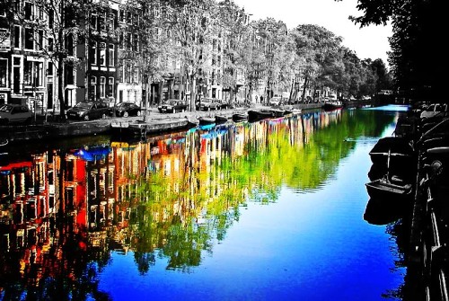
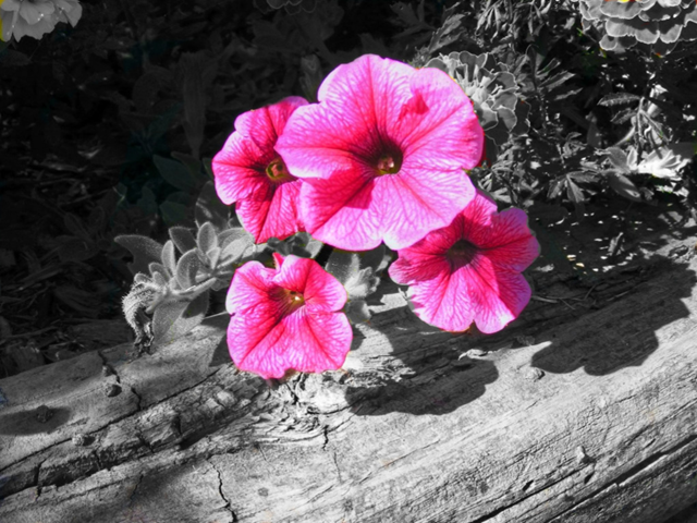
Showing posts with label basic techniques. Show all posts

Saturday, July 28, 2012

Color Splash (GIMP)

This tutorial will show you how to make a black and white photo with a "splash" of color in it. This technique can be used for modeling competition entries and other types of edits. Here are some examples of the color splash effect:


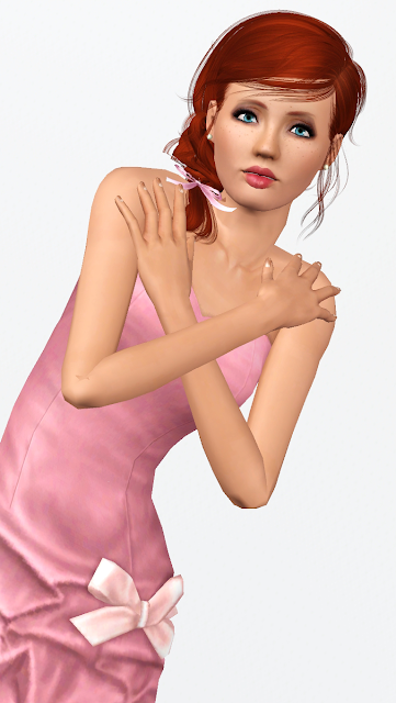
For this tutorial, I will be using this photo of one of my models, Dana. If you would like to use this photo for experimentation, you can find it here.


First, Open your photo in GIMP.


Next, Duplicate the layer by right clicking on the layer in the palette and choose "Duplicate Layer".

Now you are going to make your new layer black and white. To do this, go up to the "Colors" menu and then choose "Desaturate"


Now here is where you can choose your method. One method is to take an eraser and erase over the areas that you want colored. The other method, which I am going to use is called a "layer mask".
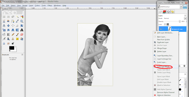
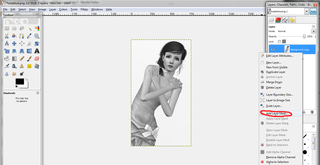
To add a layer mask, make sure your black and white layer is selected, right click the layer and choose "Add Layer Mask". A box will pop up. There are many different options. For this tutorial, I chose the first option, "White (full opacity)". After that is done, you will see a blank layer attached to your black and white layer. Layer masks are used for many purposes and are good for blending images together. When you paint with black on a layer mask, it will hide the part of the image that it is attached to (like an eraser but is easier to correct if you mess up). When you paint with white on a layer mask, it will show areas that were hidden when the black was used.


Now, to get the color splash effect, click on the paintbrush tool. Choose the desired size brush, depending on the size of your photo and adjust the hardness of the brush. The higher the hardness is, the sharper the edge of the brush will be. For this particular effect, I am going to choose a plain round brush.

With your layer mask selected, paint with black (#000000) over the areas that you want colored. As explained previously, the black simply hides those areas. Zoom in or out when needed.  For this photo, I want her dress, lips and eyes to be in color so I painted over those areas.


If you erase too much, like I did below, go back over the area that was mistakenly colored with white (#ffffff). If you were to use an eraser instead of a layer mask, it is more difficult to correct these mistakes.

After all is said and done, your finished product should look like this.


And there you have it. If you have any questions, don't be afraid to ask :)

Wednesday, March 21, 2012

Animation Basics


First, I am starting out with a plain white document with black text for tutorial purposes.


To open the animation palette, go to Window/Animation.

 
The palette will pop up. It should be at the bottom of the screen. It looks like this: 


If it looks a little different, make sure the tab called "Animation (Frames)" is selected.
The box at the bottom of the palette that looks like a piece of paper with the corner turned up will give you a new slide (it works pretty much the same way as a layer). The trashcan icon next to it deletes slides. 


In the main part of the palette, you can see the slides that will be used to animate. Think of the slides as a flipbook. The first slide will "flip" into the next and so on.
The numbers on the bottom of each slide that says "0 sec" is where you can set how long that slide will appear before changing to the next.


Now you are ready to start animating. Go to this page for a tutorial on the first type of animation.

Monday, February 13, 2012

Text Effects (GIMP)

Text Effects (GIMP)
 
This tutorial will show you what kinds of effects you can add to text to make it "pop".

Adding effects to text in GIMP is actually quite simple. To start out, I just have black text on a white background. 


I found out that there are some pretty cool pre-made effects already in GIMP. To access them, go to the "Filters" menu in the bar at the top of the page and go down to "Alpha to Logo". Under that section there is a whole list of pretty cool effects. All you do is click on them. A box will pop up and you can adjust the settings how you want. I left everything on the defaults.  


Here are a few of the effects:

"Glowing Hot" 


"Alien Neon"  


"Neon"


"Chrome" 

 
"Frosty" 


For some reason, when the effects are applied, it crops the image to just the text. If anyone knows how to correct this or why it does this, I'd like to know.  

Okay, now for a couple less dramatic, do-it-yourself, effects.

First I'll show you how to make a drop shadow behind the text.

Go to the "Filters" menu, choose "Light and Shadow", then choose "Drop Shadow".


A window will then pop up. I left everything on the default settings except for the Offset Y which I changed to 0.
 
  
This is what you get. 

  
As you probably notice, part of the background is cut off. To fix this you can use the scale tool (above the paintbucket), click on the background and drag until it fills the full document again. 


 Another easy effect is called "Perspective". To access this, go to the "Filters" menu, choose "Light and Shadow", then choose "Perspective". A window will pop up. I left all the settings on default and clicked "OK". 


This is what you get:
  

To me the shadow that is created it pretty sharp looking and I want it to look more blurred. To do this go to "Filter", "Blur", "Gaussian Blur". I changed the horizontal and vertical blur radius to 10px and clicked okay. 

  
This is the result: 

  
I like it but I want the shadow to be a little lighter so I lower the opacity (located at top of layers panel) to 50%. This is what you get: 

  
Well, that is all that I have in terms of text effects for GIMP for now since I am still learning this stuff myself. Hopefully this helped you guys get started at least.

Basic Siggy Techniques (GIMP)

 Basic Siggy Techniques (GIMP)

Video Tutorial:


**This is made to go along with the step-by-step, not as a stand alone tutorial. Enjoy!**


Step-By-Step Tutorial:

Just letting you know, I'm not very experienced with GIMP so I tried my best with this tutorial. 

First, open GIMP

Once it is open, go to File/ New... A window will pop up. The size I usually use for siggys is 600 pixels (width) x 100 pixels (height). For the resolution I usually keep it at 72 pixels. If it is a bigger document I will change it to around 300 pixels. You can leave everything else on the default settings. After changing the size and resolution, click "OK". 
 

 You now have a blank document and you are ready to start making your siggy! 


Let's start out with the "Text" tool. It looks like a capital A and is located above the pink eraser icon in the toolbar on the left-hand side of the page.  


Choose a font from the drop down box at the bottom right of the page and the size. Click somewhere on the document and a text box will pop up. Type whatever you would like to appear on your siggy. Click "Close" to close the box. To make the box that the text is in larger, click and drag one of the corners. To increase/decrease the size of the text click the arrows under the font options to adjust size.  


 Before I go on, I want to explain about the layers panel. This panel is by default at the top right hand side of the page. You can move it wherever you would like. If you cannot see it, go to the "Windows" menu in the top bar and choose "Dockable Dialogs" and then "Layers" and it should show up. As you can see, at this point you have two layers, the background (bottom) is the first layer that comes with the new document. The layer on top is your text layer which is automatically created when you add text with the text tool. Layers listed towards the top of the layer will be on top (or in front) of the layers underneath it in the list. Keep in mind that when you add text (or any images) it will automatically be added above the layer you have currently selected. To move a layer, have it selected and click the icon that looks like a four way arrow. 
 
Now let's add a plain background. First choose a color from the color panel. It looks like two boxes overlapping each other. The box in the front is the foreground color and the box behind is the background color. Double click on the front (foreground) box and choose whichever color you like. For this tutorial, I chose red. Now make sure your background layer is selected and click on the document. Your plain color should be behind the text. If it is not then drag the colored layer underneath the text layer. It should look something like this: 


Now that we have a background and some text, let's add a new layer. Click on the little icon at the bottom of the layers panel that looks like a blank piece of paper. If you have the background layer selected, it will add it between the background and the text layer (which is where we want it for the purpose of this tutorial). If you had the text layer selected, then the layer was added above the text layer and you will need to click on the name of the layer and drag to move it underneath the text layer.

Next, we will use a brush to add a nice little touch to the background of the siggy. Click on the "Paintbrush" tool (which looks like a paintbrush) and then go to the drop down box under the tools to choose a brush shape(and use the colors palette to choose the color you want). For this tutorial, I chose a brush called sparks (it comes with GIMP) and I left it on the default settings. Make sure your newest layer is selected and click and drag to "paint" the background. If you just want a plain design click once.


Okay, so now we have the design painted. It looks nice the way it is but I want to take it a step farther. I'm going change the "Mode" (the drop down box at top of layers panel, see picture below) to "color" which gives it a nice overlay. I'm also going to adjust the opacity(bar right underneath the Mode box) and change it to around 69% to make the design to blend in. This is completely optional of course. This is just what I felt like doing with it.
  

And you're done. This is the finished product.  


This is a very simple siggy but I use this technique all the time. Once you learn the basics, you're on the way to making really awesome siggys. The best way to improve is to play around and experiment with different effects. If you have any problems, just leave a reply here or comment on my page. Have fun and good luck!

Basic Siggy Techniques (Photoshop)

Basic Siggy Techniques (Photoshop)

Video Tutorial:


**This is made to go along with the step-by-step, not as a stand alone tutorial. Enjoy!**

Step-By-Step:

First, open Photoshop.

Once it is open, go to File/ New... A window will pop up. The size I usually use for siggys is 600 pixels (width) x 100 pixels (height). For the resolution I usually keep it at 72 pixels. If it is a bigger document I will change it to around 300 pixels high. You can leave everything else on the default settings. After changing the size and resolution, click "OK".
 
 
You now have a blank document and you are ready to start making your siggy! 


Let's start out with the "Horizontal Text" tool. It looks like a capital T and is located above the black arrow icon in the toolbar on the left-hand side of the page.

Choose a font from the drop down box at the top of the page and the size and type whatever you would like to appear on your siggy. If you want to change the size of the text after you typed it out, highlight it by having the text tool selected and dragging over the text you want to change. Then just choose (or type in) a different size in the box at the top of the page. 


Before I go on, I want to explain about the layers panel (circled in the picture below). This panel is by default at the bottom right hand side of the page. You can move it wherever you would like. If you cannot see it, go to the "Windows" menu in the top bar and choose "Layers" and it should show up. As you can see, at this point you have two layers, the background (bottom) is the first layer that comes with the new document and is locked (meaning you cannot use it unless you unlock it). The layer on top is your text layer which is automatically created when you add text with the text tool. Layers listed towards the top of the layer will be on top (or in front) of the layers underneath it in the list. Keep in mind that when you add text (or any images) it will automatically be added above the layer you have currently selected.
 
  
Now let's add a plain background. First choose a color from the color panel. It looks like two boxes overlapping each other. The box in the front is the foreground color and the box behind is the background color. Double click on the front (foreground) box and choose whichever color you like. For this tutorial, I chose red. 

  
 Now make sure your background layer is selected and click on the document. Your plain color should be behind the text. If it is not then drag the colored layer underneath the text layer. It should look something like this: 


Now that we have a background and some text, let's add a new layer. Click on the little icon at the bottom of the layers panel that looks like a square with a corner being peeled up. If you have the background layer selected, it will add it between the background and the text layer (which is where we want it for the purpose of this tutorial). If you had the text layer selected, then the layer was added above the text layer and you will need to click on the name of the layer and drag to move it underneath the text layer. 


Next, we will use a brush to add a nice little touch to the background of the siggy. Click on the "Paintbrush" tool (which looks like a paintbrush) and then go to the drop down box in the top bar to choose a brush shape(and use the colors palette to choose the color you want).

For this tutorial, I chose a brush that looks like rays from the sun ( download link provided under "resources" section on this thread) and I chose white for a color. Make sure your newest layer is selected and click to paint on the design. 


Okay, so now we have the design painted on but it seems to take away from the text, making it hard to read. To fix this, make sure the "blending options" (Box at top of layers panel, see picture below)is set to "Normal" which it is by default. Change the opacity to make the design more transparent. I changed it to 25% which gives it a nice overlay. If you have a lighter background color you can try using the "Overlay" mode instead to get a cool effect. I will cover more about the Blending options box in another tutorial. 


 And you're done. Here is the finished product. 


 This is a very simple siggy but I use this technique all the time. Once you learn the basics you're on the way to making really awesome siggys. The best way to improve is to play around and experiment with different effects. If you have any problems, just leave a reply here or comment on my page. Have fun and good luck! :D